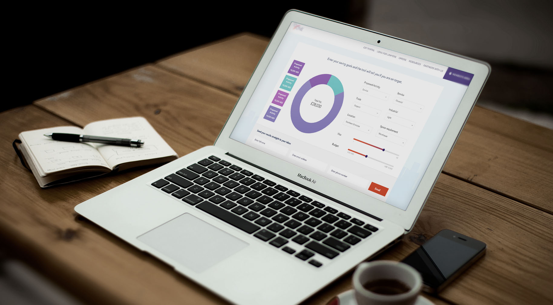
case study
10 Zone
overview
Simplifying a complex exchange platform
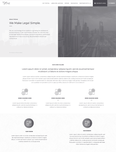
10 Zone is a simplified service platform that is designed in helping businesses start in the easiest and most inexpensive way possible.
10 Zone has several years of experience in helping small businesses with registrations, compliance, and intellectual property. The company has desired to introduce this business model in a consolidated, simplified, and integrated platform.
A manifold of pages
Simplifying a complex exchange platform
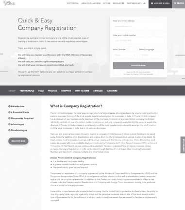
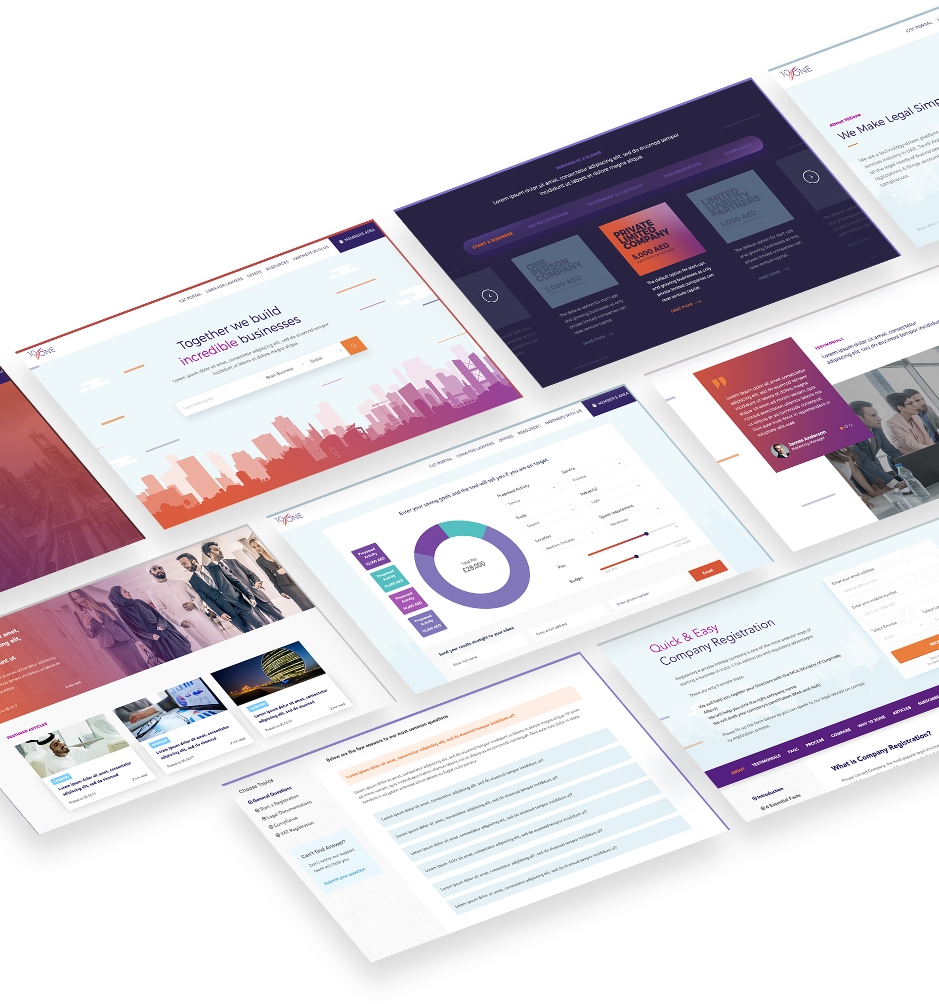
Given 10 Zone’s end-to-end new market consultation for every industry and business need, it is no surprise that they have a load of information on each page. Our challenge was to minimize the number of pages and content without compromising the quality of information.
user journey
Smooth UX across a complex process
New market entry is a multi-step and complex process. We knew our design and user journey had to be direct and simple, ensuring users would not be lost within the site and that they would easily find what they are looking for in just a few amount of steps.
consultation
Creating end-to-end, pan-industry consulting
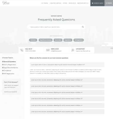
Each industry and business segment needed a clear and distinct user journey. Our challenge was to streamline user experience in between and within segments to enable users to find relevant information in the easiest way possible.
Approach & Insight
initial analysis
data-aos="fade-up" data-aos-delay="500">Complex Information Architecture. Intuitive UX
With the complexity and density of content, and our mandate to drive conversions, we knew our approach had to find a way to balance a complex information architecture with an intuitive UX.
Step 1:
Choose your user journey
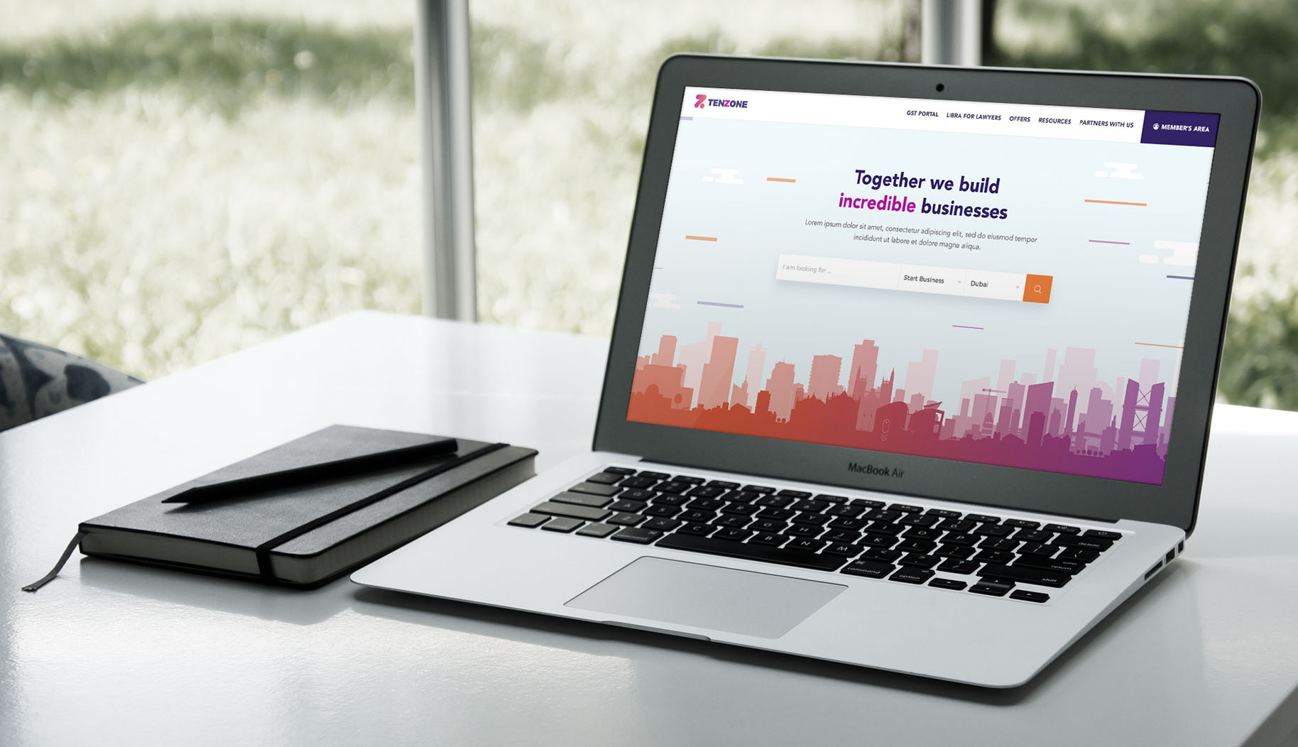
Located on the landing page, our custom search provides an intuitive and efficient way to organize information. It also helps users choose the path they wish to explore on their user journey
Step 2:
Go through a simple process
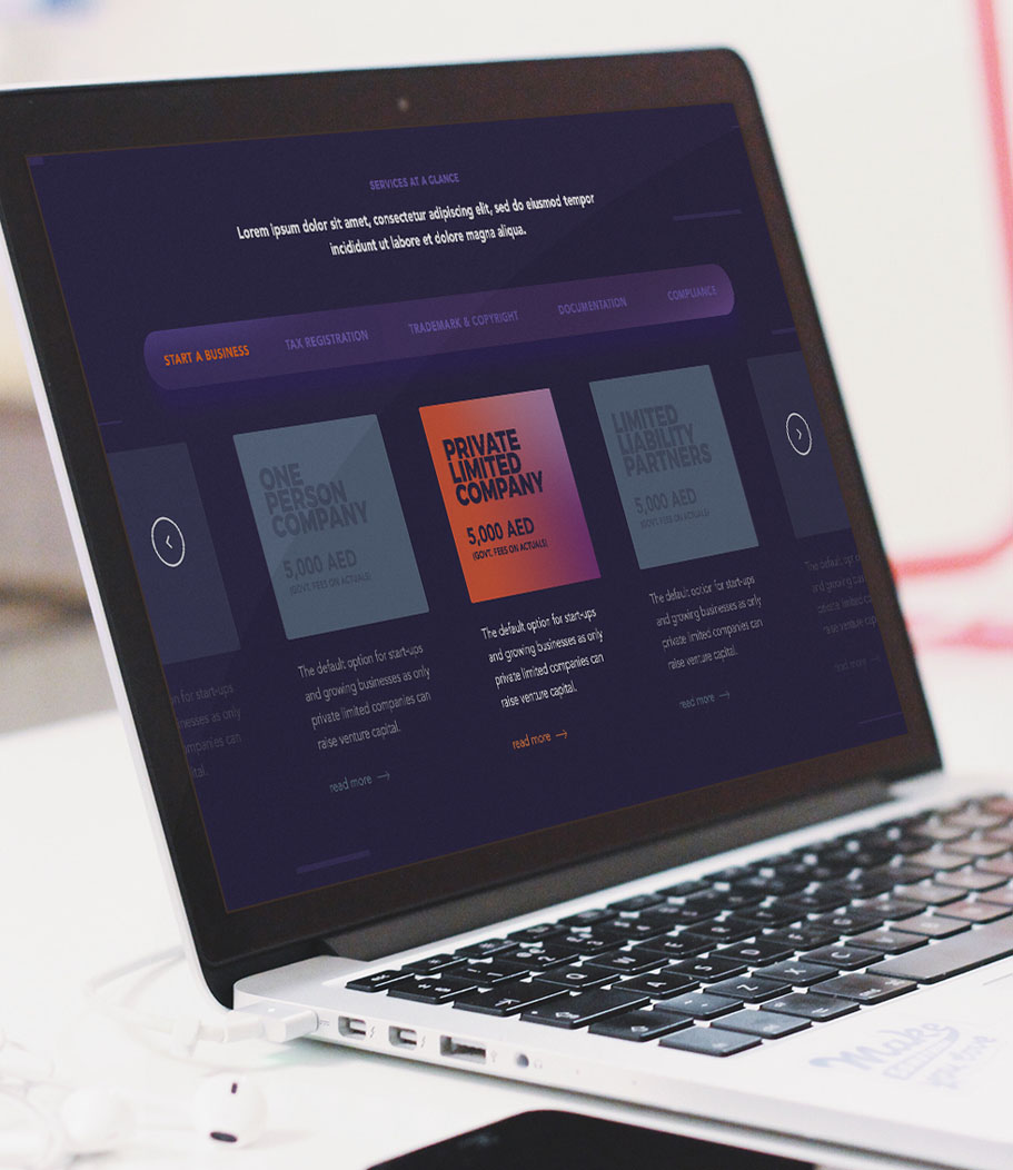
After finding a service, a user’s key concern is about understanding the processes and the costs. We simplified this step by enabling quick links and an easy information overview to help the user make a quick and informed decision.
Step 3:
Action your decision
To drive conversions, we wanted to make sure that at any point in the user journey, the viewer could action a request. To do this, we made the Call To Action buttons stand out by making them bold and clear.
typography
Main Title

Montserrat - Extra Bold
BODY TEXT

Montserrat - Regular
color pallette
primary
- #312366
- 418 C
- #e26012
- 418 C
- #b2119e
- 418 C
- #e9f7fd
- 418 C
secondry
iconography
simplifying user journey
XYZ pages to 3 simple steps
We simplified a content-heavy site with hundreds of pages and dozens of steps into a seamless user journey with three easy to use tools
segmented search
Choose your user journey
Located on the landing page, our custom search provides an intuitive and efficient way to organize information. It also helps users choose the path they wish to explore on their user journey

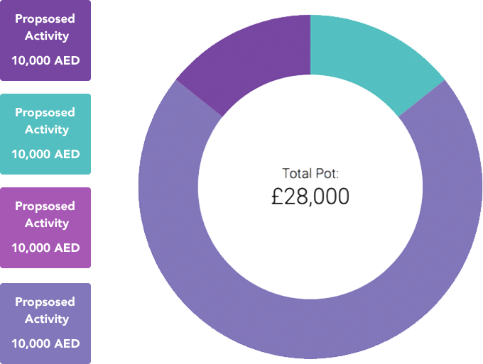
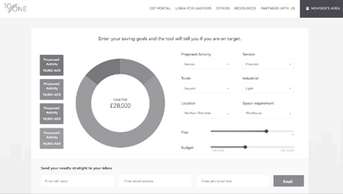
cost comparison tool
Go through a simple process
After finding a service, a user can easily find the information related to processes and cost because we have simplified the content and highlight the important information useful for a user to be able to make a quick and informed decision.
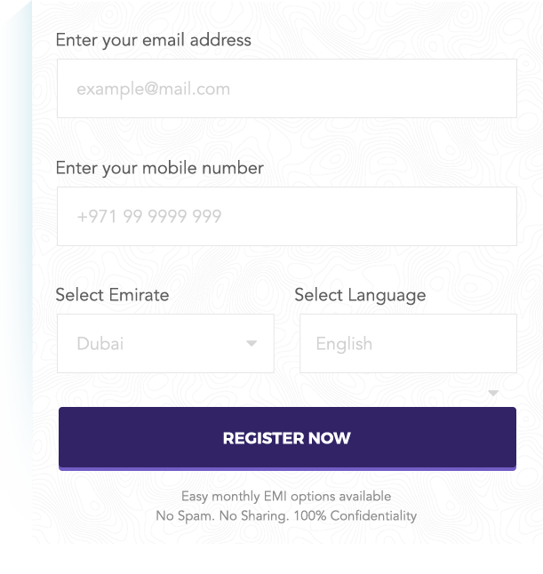
CALL TO ACTION
Action your decision
To do this, we made the Call To Action buttons stand out by making them bold and clear.
interactive
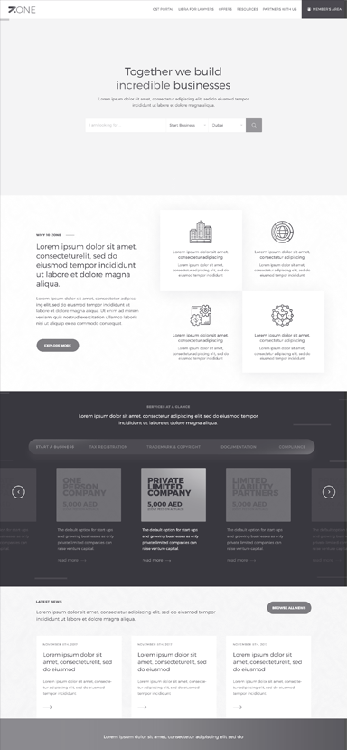
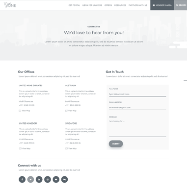
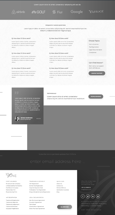
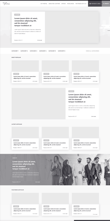
We believe it’s essential to build a structure before populating content.
Much like laying the foundations for a home before filling in the furniture, laying out wireframing before visual design allows us to map out the entire site, giving us a high-level overview of a comprehensive offering.
